Wednesday, 6 May 2009

Michael Thompson

Michael Thompson was born and raised in Washington State. He worked alongside his father who owned a small studio. He graduated at the Brooks Institute of Photography. He then moved to New York where he worked alongside Irving Penn. He has photographed celebrities and models for various magazines including; Vogue, Vanity Fair and GQ.
In his time as a Photographer he has also helped with advertising campaigns for Gap, Tiffany and Co, John Frieda, L'Oreal, Chanel, Oil of Olay, MAC, Armani.
He has also done many fragrance campaigns; Red Door by Elizabeth Arden, Believe by Britney Spears, JLO by Jennifer Lopez, Unforgiveable by Sean Jean.
He has also directed TV Commercials. Lovely by Sarah Jessica Parker fragrance. Furthermore, he has had some books published.His first book being "Michael Thompson: Images was published in 2005.


Markus Klinko

I first saw Markus' work when I went to see Britney Spears at Wembley in 2004, I saw his work in her tour book and thought the images were fabulous.
Markus Klinko works alongside Indrani, this team started collaborating in 1995. Their first magazine cover was with thanks to Isabella Blow, she gave them their debut for the London Sunday Times.
Some of their clients include Hugo Boss, Pepsi, Nike, Puma and seen in magazines such as Vogue, Vanity Fair.
Above and below are images from the Britney Spears, Onyx Hotel Tour.
Other examples of their work;
Markus Klinko is a French-Hungarian and was born in Switzerland. He became one of the worlds best Harp players but 1994 decided to take up his hobby - photography, whilst doing this he met his partner in crime - Indrani Pal-Chaudhuri.
Indrani Pal-Chaudhuri was brought up in India, England and Canada. At the age of 14 she was a model and it was only later she decided to pursue a career in photography with Markus, after studying it previously.

http://www.markusklinko-indrani.com/

Monday, 4 May 2009

Chila Burman

Chila Burman visited my Graphic Design class when I was at college and I really liked her work. After revisiting here work and researching her I actually found out that she is an artist in residence at East London, small world!

Chila has explored in many different mediums over the last couple of decades. She has explored the use of photography, paintings, installations, printmaking, video and film. A lot of her work to date has been influenced by her heritage, Asian Feminity.

Chila was born in Liverpool and lives and works in London. She was educated at Southport College, studying an Art and Design Foundation course. By 1981 she studied BA Fine Art and Graphic Design at Leeds Technic, finally ending her education with an MA Fine Art (printmaking) at Slade School of Art.

Since this time Chila has partcipated in many exhibitions and picked up countless awards for her work.

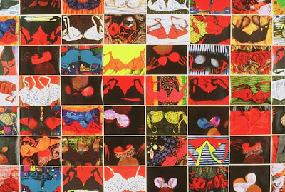
Chila uses lots of ice-creams, which remind her of her childhood as her parents owned there own ice cream truck, also she uses ladies underwear in a lot of her collages.

Her work involving collages of underwear helped me to develop a final piece at college. I really liked the vibrant colours she used and the idea that she wasn't afraid to use whatever she liked as her subject matter.
Sunday, 3 May 2009

Peter Knock - Illustrator, also my college teacher

I chose to look at Peter Knock's work for bit of variety, I've looked at Graphic Designers, Fine Artists, Photographers and Fashion Illustrators which had all inspired me so I figured why not look at my first teacher of Graphic Design who has inspired me to be where I am today.

As well as teaching Pete is an Illustrator and Artist. His clients have included MCA Records, Esquire, Rolling Stones Magazine, Radio Times, Pentagram Design and the Sunday Times.
His Influences: - "Whilst directly influenced by the cinema, I am continually fascinated by the potential of the 'frozen moment' as a narrative device. The impact on painting of formal composition, such as the golden section, in creating a potential means of achieving a harmonious and memorable image, absorbs me. Above all, I strive to 'tell a story'."


My first piece of work I did with Pete was highly influenced by this piece of his. Our brief was 'My First Time' it could be about anything we liked, as I had just started learning to drive I decided to base my project on the first time I learnt to drive and produced a collage looking into a rear view mirror. Looking back it wasn't all that great but it was my first piece at college and one that paved the way.


Chuck Anderson

Chuck Anderson is a relatively young photographer born in 1981.
Already in his short years he has so many famous clients that he has worked with; Adidas, Bic, Burton, Honda, Island/Def Jam, McDonalds, Microsoft, Ministry of Sound, Nike, Nokia, Pepsi, Reebok, Rolling Stone, Sony, Warner Brothers Records, to name but a few.
His inspiration comes from seeing other people succeed or fail. "When I see failure, I try to take notes from it and do better and learn a lesson from someone else's mistake. Or even my own. When I see success, it just inspires me as it would anyone else. Take Michael Jordan. He is success. He embodies success 100%. That's why he's so inspiringWhen I see failure, I try to take notes from it and do better and learn a lesson from someone else's mistake. Or even my own. When I see success, it just inspires me as it would anyone else. Take Michael Jordan. He is success. He embodies success 100%. That's why he's so inspiring"
His work is highly driven by neon or glowing lights, and loud, bright colours.
He is influenced by Geoff Mcfetridge, Phil Hale, KAWS and Jim Phillips.
This piece is one of my Surrealist Typography which relates a bit to the way Chuck uses light in his images. Although mine hasn't been severly Photoshopped like his work. The basis is there.



Sara Singh

Sara Singh is a fashion illustrator and I have admired her work for many years.
Some of her clients include; Mac Cosmetics, Tiffany, Penguin Books, L'Oreal, Estee Lauder, Bloomingdales, Givenchy, Visa, The New York Times, Vogue and various other famous make up specialist and magazines.

Unfortunately information on Sara Singh is extremely difficult to find. She has two main websites which showcase her work. www.sarasingh.com is her main website address.
www.art-dept.com/illustration/singh/index.html is where the rest of her work can be found.
As I am unable to give any information about her background I will talk about my feelings for it.

I love the use of colour and typography within a fashion illustration.

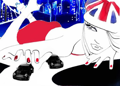
Whilst at college I recreated this piece of work. I really like the deep shades she uses in the background and foreground and then uses the main subject matter as just a simple outline. This is definately one of my favourite pieces.
I really like the blend of the watercolours on the above image. I think the use of outline and watercolour work really well. I like that she is quite rough with the flower yet it looks affective.
This is one of my other favourite pieces of Sara's work. I think the shoes on their own are just really realistic and well painted and the Eiffel Tower in the background just adds a bit of depth to the image.
This is another image with a French theme.
Again not much colour used but the strips of watercolour are applied loosely and give a great overall effect.
This was one of her designs for MAC. I think this is one of her more duller paintings. So haven't got much to say on this one.
This is definately one of my favourite mostly because I like the dress but also the colour of the dress. I just think its really stunning and girly.
I love the simplicity of the above image. Its just in neutral black and white tones. This is really detailed, really pretty.
I recreated the flowers from this image in a project at college Sara makes them look so easy to create, it really isn't.
Again the use of black and grey tones to create this look.
Girly, simplisitc and beautiful.
Simple and beautiful.